
Used by I/O and Calculations, Analog Input, Analog Status, Digital Input, Digital Status, Pump Status, Analog Output, Analog Control, Digital Output, Digital Control, MultiWrite, Pump, Selector Switch, Trigger.
* Does not use the Style Settings tag.
The Momentary Button widget is used to draw a button that will send one value when pushed and (usually) the opposite when released. Both the value to write when pushed, and the value to write when released, must be provided before the button will be enabled. While similar in appearance to a Legacy Set Value Button Widget, it has a very different purpose.
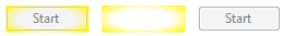
A variety of Momentary Button configurations
This object can be displayed as a button, a hotbox, or a button surrounded by a hotbox. Only the button will have a label (whether surrounded by a hotbox).
Works on touch screens (Windows and VIC) only if not using the hotbox option.
On the Anywhere Client, momentary buttons work as toggling buttons (one tap for down, another tap for up).
Using the SCADA system instead of the PLC for pulsed control carries risk. Carefully consider what might happen to the system if something interrupts communication between the signal at the start and the signal at the end of the pulse.
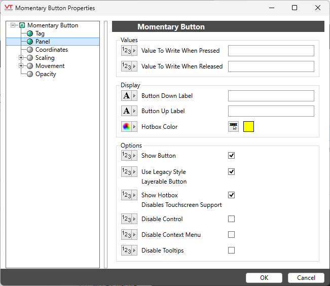
Configuration options for the Momentary Button
Value to write when button pressed
Set the value that will be written when the completed button is clicked. If the associated tag is an analog output, this may be any value that is legal for that tag. Otherwise, this value should match one of the configured states for the associated digital or selector switch.
If this value is not set, the button will not work.
Value to write when button released
Set the value that will be written at the moment when the operator releases the button.
Button Down Label and Button Up Label
Provide the labels that will be displayed on the button. A different label will be displayed while the button is being clicked than will otherwise be shown. This can provide useful feedback to the operator who can be assured that the button has indeed been clicked and is presumably doing what it is supposed to.
If the label is to include an ampersand (&), enter two ampersands (&&).
Show Button
Deselect if you want to show only a hotbox with no button.
At least one of the button or the hotbox must be shown for this control to operate.
Use Legacy Style Layerable Button
Must be selected in order to add a hotbox.
Show Hotbox (disables touchscreen support)
Add a hotbox (or only a hotbox if Show Button is deselected).
As noted in the label, when a hotbox is enabled this widget will not function when displayed on a touchscreen
Hotbox Color
Opens the Select Color Dialog from which you can select a color for the hotbox object. Defaults to yellow.
Options
Disable Control / Disable Context Menu / Disable Tooltips.
Refer to Operator Interaction Controls for a full description of these standard widget options.
Buttons & Switches\Basic Controls\
Basic Components\Button Controls\
